Most of you reading this blog probably have some, or a lot of, experience with graphic and web design. But what about print? At some point or another you are going to want to print something you’ve crafted with your Illustrator and Photoshop skills.

Whether it’s a poster that you have been commissioned to make or possibly you want to print your own business cards, it can be tricky to get just right. Hopefully this article can help you and guide you towards printing perfectly.
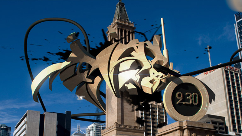
Despite what Banksy fans may tell you, the days of the humble spray can and stencil could well be numbered. The most inventive of designers and graphic artists are pushing our notions of graffiti to the limits, using perspective, big ideas and technology to create real masterpieces.

Some have even gone super hi-tech, taking graffiti off the streets and swapping paint for PCs and laptops. Sites such as Graffitti Technica are celebrating this progression of graffiti into the digital space, which involves enhancing photos of real-world vistas with 3D structures and adornments. And indeed this evolution is resulting in the kind of electronic art that deserves recognition.
3D graffiti can take many forms – but the result usually presents you with the kind of augmented reality that is at once hard to take in and hard to tear your eyes from. As you’ll see from the examples below:
I am going to show you how to create a CSS3 drop down menu using all the latest CSS3 techniques. We will go over how to use border radius, gradients, and box shadows to turn a basic drop down menu into glossy styled navigation.
To some, these new CSS3 properties might be intimidating, but I will try to break the code up into small chunks and explain as we go.
The sheer volume and diversity of online apps that designers can leverage to create a website these days is extraordinary.
Although learning to code and mastering desktop design applications are still very valuable skills, they’re no longer a prerequisite for designing great websites.

With the advent of a rapidly growing ecosystem of online apps, designers can now literally start from scratch and create an amazing, fully custom website almost 100% in the browser.
Here are some of my favorite online apps I recommend for web designers to bring into your repertoire – many of which offer a free option by the way.
Seeing things in black and white usually involves being narrow-minded. But one of the most bold of design trends delivers the very opposite.
Using black and white in web design provides the ultimate in readability and impact, ensuring all communication between the brand (or site owner) and the online audience is clear and memorable.

But doesn’t a lack of colour automatically equate to a lack of personality and a dearth of vitality? Not necessarily – as these fabulous examples demonstrate beautifully!


